Overview
Volt is a UI component library crafted with Unstyled PrimeVue Core and Tailwind CSS.
What is Volt? #
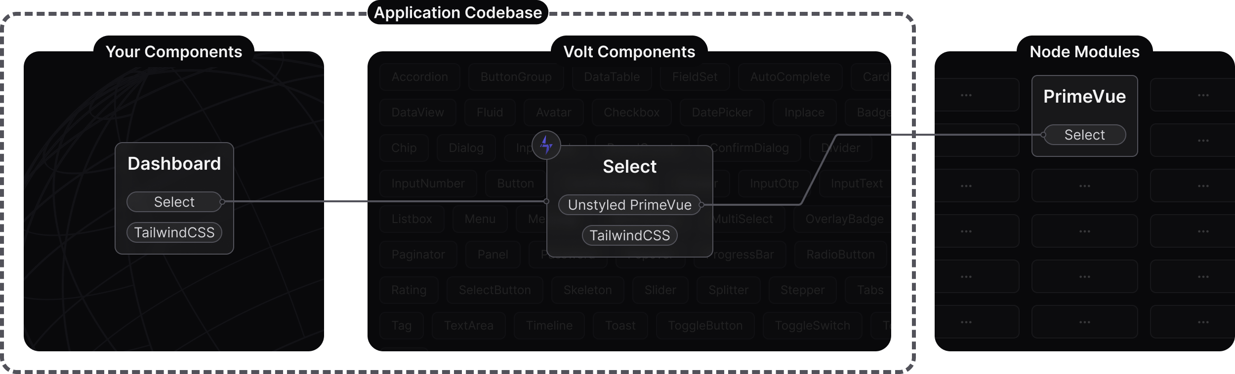
Volt is an open source UI component library implemented with the Unstyled PrimeVue components. Volt follows the Code Ownership model where the components live in your application code base as your own UI library rather than imported from node_modules as a 3rd party. Main benefit of this approach is full control over styling and ease of customization. Internally a Volt component, wraps its PrimeVue counterpart, removes the default design token based theming and applies Tailwind utility classes via the pass through attributes feature.
Unstyled PrimeVue
Each Volt component enables unstyled option on the wrapped PrimeVue component, as a result opinionated class names such as p-select and design tokens e.g select.background are turned off. This approach opens up the possibility to style PrimeVue with an alternative approach. This is where Volt comes in with the power of Tailwind CSS.
Pass Through
The pass-through is a PrimeVue API to access the internal DOM elements of components to add arbitrary attributes. The most important attribute for Volt is the class to pass Tailwind utilities to the internals. It is highly recommended to review the pass-through documentation to learn more about how Volt works.
Tailwind CSS
Tailwind CSS v4 is utilized by Volt components along with the tailwindcss-primeui plugin to style the components. The plugin adds custom variants like p-selected, and p-editable to refer to the props and state of the components so that the theme object consists of a key-value pair. Volt components implement the PrimeOne Aura theme with Tailwind that serves a boilerplate for your custom designs.
Migration
Once the Volt components are located in your application codebase, they are not meant to be updated since their styles are designed to be customized per your requirements. Simply updating the PrimeVue version would also update your own Volt based components as well for maintenance updates.
Comparison #
PrimeTek has been building UI libraries since 2008, and our extensive experience has led us to this conclusion: there is no 'one-size-fits-all' UI library that caters to everyone's preferences. PrimeVue and Volt are created for different requirements and audiences as a result. Volt has a smaller scope compared to PrimeVue with a set of essential components. Tailwind can be used with PrimeVue components to cover numerous use cases, Volt takes the integration a step further to allow theming the components with Tailwind as well.
In conclusion, if you prefer complete control over component styling using Tailwind CSS, and do not need the full feature set of PrimeVue, then Volt would perfectly meet your requirements.
| PrimeVue | Volt | |
|---|---|---|
| Location | node_modules | Application codebase |
| Styling | @primevue/themes and design tokens | Tailwind CSS utilities as pass-through classes |
| Download | NPM registry | GitHub via npx command |
| Components | 90+ | 50+ |
Customization #
Customization is the most important value of Volt. Instead of CSS overrides of 3rd party UI libraries or learning design token APIs, the theming is integrated within the component for you to add customizations per your needs e.g. custom branding. As example, here are 3 different Select components based on Volt, first one is the default, second one is compact and third one is quite fancy. With Volt, the convenience of Tailwind allows for the creation of custom designs. This opens up various possibilities, including the development of a in-house UI library tailored to your organization's needs.
tw-merge #
Volt components leverage the tailwind-merge utility to combine custom classes with default ones efficiently. This feature is particularly useful when you want to customize individual components by integrating external classes.
The classes passed to the pt:{section}:class attributes are automatically merged with the default classes. It's important to note that the regular class attribute might not be applied due to its lower precedence. However, the inline pt version merges successfully, allowing for effective overrides per component instance.
Consider the following test case that demonstrates this behavior. In the first case, the custom bg-primary text-primary-contrast might not be applied because the regular class attribute has lower precedence. On the other hand, the pt:root:class attribute in the second case will merge the custom classes with the default classes perfectly.
<template>
   <div class="card flex justify-center gap-4">
        <InputText class="bg-primary text-primary-contrast" value="Fails" />
        <InputText pt:root:class="bg-primary text-primary-contrast" value="Works" />
    </div>
</template>

<script setup lang="ts">
import InputText from '@/volt/InputText.vue';
import { ref } from 'vue';

const selectedCity = ref(null);
const cities = ref([
    { name: 'New York', code: 'NY' },
    { name: 'Rome', code: 'RM' },
    { name: 'London', code: 'LDN' },
    { name: 'Istanbul', code: 'IST' },
    { name: 'Paris', code: 'PRS' }
]);
</script>